")
It can help us decide the colors of our walls, the furnishments we surround ourselves with every day, so the psychology of color is never far from us. The same way cooler tones give us a calm feeling, like the green of a peaceful and relaxing ocean, mixed with a powerful blue to remind you of its strength, the colors with which we surround ourselves have some sort of mystical power.
There is a rare disease called synesthesia, and in the most common form of this very rare disease, individuals will associate different colors with certain letters or numbers. They are usually in flashes of colored light that flare across the mind. We will give you the low down on what color psychology is, how it is used, and what different colors can predict for your behavior.
At the moment, the main users of the psychology behind colors are those who are marketing to us, but the field is growing and very soon many industries will be better able to harness it. At the moment, it is used heavily in marketing as a tool to make people more susceptible to the marketers’ claims. It is a particularly interesting field of study to actual psychologists, who often use colors to induce a feeling of calm in their patients. It can also be used by designers, to give their clients whatever feeling they want while they work from home. All of these people put this psychology to good use, but the main users are marketers, trying to infiltrate our buying habits.
What Is It?
The science behind this psychology is the simple premise that colors can have an influencing factor on what we will do or how we will feel. In this sense, it is a great tool for marketers, making them able to influence how we feel about a project. In other words, it is a determinant of your future behavior or patterns of behavior. The color of a thing can affect everything about how you will react to it, including the flavor of a meal. The color can greatly influence how we perceive a thing, even if we are not readily aware of it.
Where Do We See It Used?
The psychology of color is widely used in marketing. It is a widely held belief among marketers that the color of a brand’s image can influence how you see the brand. For instance, it can make you view them more favorably or not. The ways in which we are affected by different hues aren’t well understood, but it is clear that they do influence how we feel. Consider how a plate of a certain hue might increase our appetite. In this way, we see the power that is held by certain colors.
Why Is Color Psychology Important in Marketing?
As previously stated, marketing giants have been relying on this psychology, even without appearing to, for quite a long time. Just although some colors are subtle in affecting how we feel about a certain thing, the reason why an advertising executive made a decision may lie in the study of this field. There are actually a growing number of scientists and those with expertise in the brain who endeavor to parse through data that they collect through various channels.
List of Color Meanings
We could not very well talk about color psychology without going over some of the more popular colors. See the impact these colors have on the decisions of regular people.
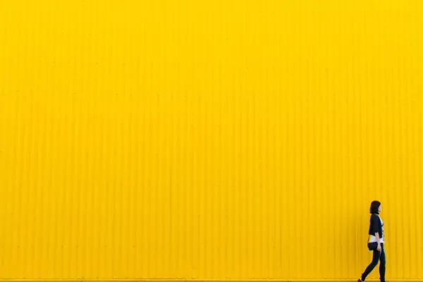
Yellow
For yellow, the prevailing emotion is optimism. The reason that yellow is so widely used in marketing is that it gives you an optimistic feeling about your purchase. For instance, Amazon uses a yellow logo to give you optimistic feelings about the purchase you just made. It is a similar reason for many delivery companies to use yellow. They want you to feel optimistic that your package will end up at the right address. Optimism in your choices as a consumer is one of the strongest emotions that you can feel, and marketers are aware of this and putting it to use.
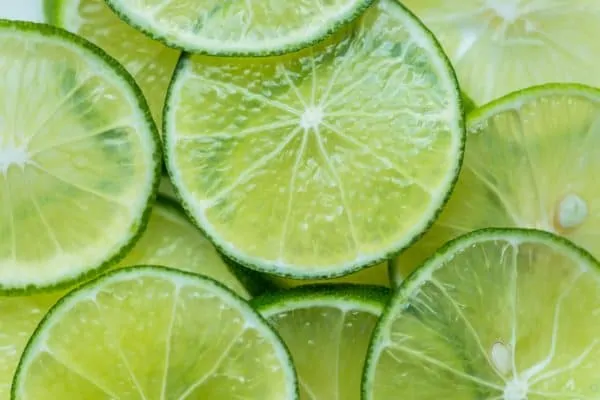
Green
For companies that want to give you a peaceful feeling, they use green. It also symbolizes youth and vitality, a powerful statement for a color to make. Drink companies such as Monster or Starbucks have a lot of green in their logos to make you feel energized even before you try their product. Generally, green is mixed with blue in a teal type color to add a calming effect to the sense of power that goes along with blue.
Red
Do you ever feel stimulated just by looking at the color red? You are not alone, and marketers have long been using red to give their audience a sense of an enthralling, fast paced lifestyle. Many logos for food products, from Lay’s to Nabiso use red. This is meant to give you a feeling of anticipatory joy right before you break into a bag of chips, for instance. Red is as far from the calming effects of green and blue as you can get.

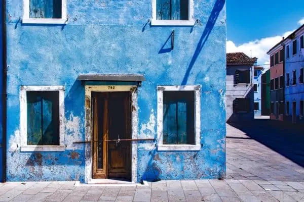
Blue
If you want to convey just how dependable a service or product is, why not use blue? For example, the Facebook logo is blue because we are meant to think that it will always be there. Oreos have a blue logo for a similar reason, they want to convey that they will never change, they will always be there for us. Though they keep coming out with different flavors, the original will always be there for you, hearkening back to days from your youth.
Orange
Being one of the least commanding colors, orange represents creativity, enthusiasm, and balance. Marketers take advantage of this color by using it to draw attention to specific parts of their website. This color really emphasizes creativity and it can be seen by the companies who use it as a primary color. Home Depot and Nickelodeon are both massive creative outlets for both children and adults.

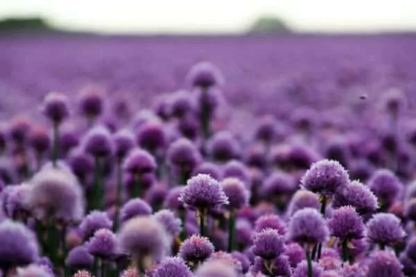
Purple
Purple is known to be the color of high class and luxury, the color of kings. That being said, it is obvious that this color would have associations to power, nobility, luxury, and spirituality. Be cautious when using this color to often, it can be perceived as annoying, arrogant, and frustrating when seen to frequently. If you look such as Twitch, Yahoo, and FedEx, you will see that it is most effective when used as an accent rather than the main color. Although all of these companies use purple as an accent, the color is still synonymous with each brand.
Gray
The color grey can evoke a range of emotions for any given person. On the one hand, it can represent positive feelings of balance and neutrality. On the other, there are negative associations with feelings of emptiness, loss, and sadness. If your company wants to implement this color into their brand we recommend use with the colors black and white. It is known to contrast well with those two colors, plus, a logo that is entirely grey will stand out as dull. Some brands that have implemented the color grey effectively include Tesla and Evian Water.

Black
This dark color, also described as the absence of color, shows up in many logos. In print, it is easy to read when splashed across any other color as a backdrop, and it can also give a brand a sense of mystery, of that spellbinding ‘it’ factor we all want. A black logo is the equivalent of saying “je ne c’est qois”, it is a truly mysterious color that will make you pause, if only for a better look.
White
Just as black can be an impenetrable, intimidating color, its very antithesis, white, evokes anything but. It symbolizes such virtues as purity and upstandingness. Many brands use white to make other colors pop, but it is also used by itself to great effect. It also represents elegance and sophistication, like the color white being used as a party’s theme.
Why It Is Helpful/Important?
The psychology of color is very important to you, both as a marketer and as a consumer. Understanding the emotions that a color can evoke will make you better at enticing people in through logos and better understand why a business chose to use a certain color in their logo. It will also help you to decide if a logo does make you feel a certain way, or if the company missed the mark. Learning the psychology around colors is also a very marketable skill that a lot of people are adding to their repertoires right now.
Likewise, a study of color psychology is now a highly sought after attribute in a lot of today’s hiring practices. Simply knowing the feelings and emotions that different colors are expected to elicit in a person is a sought after skill and it does not take long to learn. In fact, it should be an inherent knowing. Simply take stock of how a logo can affect you. You can be a perfect yardstick for how it will perform when displayed before a larger group of people. To that end, it is very useful in marketing as it can influence a person’s spending.
When It Can Be Used?
We have talked about how color psychology is widely used in marketing, but what about other industries? Interior designers who study the psychology behind color are more sought after than ones who do not. They can better understand how the color of a furnishing can change a whole room. Marketers work in a similar way, they look at how a color will make you feel and try to elicit the reaction that they think their product should evoke in you.
Similarly, psychologists are paying more attention to the colors in their rooms. Would you not rather see a person to whom you are meant to talk in a room that makes you feel at peace with yourself? The most successful psychologists are recognizing this and changing up their furnishings accordingly. A mental health professional will try to make all their clients feel safe, so they will choose to decorate an office in a calming manner.
Studying the psychology behind color is not just about what looks pretty together, though it can best be used in large doses. Just like a splash of color can highlight other colors, a large piece of color can block out other, more harmful to your peace of mind colors. Choosing a cooler color, like a blue or green will make you feel at ease and in control of a situation, but warmer colors, like red or orange, can give you a frenetic, chaotic feeling like your heart is racing. That is not to say that one color is better, or more valuable than another color, but the emotion that it fills you with can be valuable to you at different times in your life. Studying the psychology of color will help you to make more informed decisions and look at the world in a brand new way.
